Maintenance of this project is irregular. Go to the jalsti fork
instead:
jalsti.github.io/cov19de
---
old about page:
---
No reading, just clicking? Then start here: Deutschland.html
All is based on the excellent crowdsourced data by RiskLayer.com,
a research group in Karlsruhe. My instructions how to import that
data - now runs in the browser ![]() !
!
Everything on this site could just be wrong! Do not base
any decisions on this. Always do your own calculations.
If in doubt, check official sources, for example RKI.de
and BundesGesundheitsMinisterium.de
and WHO.int .
It has been a "quick and dirty" hack ... to put together quite a large
site, in minimal time. There might be errors & bugs.
Please: If you see anything here that raises your suspicion, please do
alert me. Just raise an issue on github. Thanks.
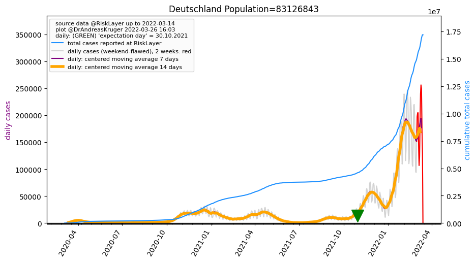
The data quality in Germany has a clear flaw: It fluctuates in a
weekly rhythm (best to see e.g. in the GRAY wavy curve in the Germany
plot) with Thursdays ~twice as many new cases as
Sundays. As that mostly delays the reporting (even though in mild
cases it might also lead to some unreported cases?), the total
number of cases x-days-later will not be (much) affected by that. But the
momentary situation "today" or "yesterday" is quite unclear. One
workaround to minimize that disturbance comes in two steps: (1) averaging
of the cumulative total number of cases over the past 7 days = add up all
7 values, and divide by 7.0, and then (2) shifting that result to the
left, by 3 days, because that is where the "center" of that 7 days average
is sitting. For this step (1) "averaging" there are actually many choices
how to do it, see e.g. this wikipedia page - for now we are choosing a central "simple moving average".
This is used in two places --> The GREEN
triangle in each plot marks that day. And all comparison heatmap
tables are sorted by that 'expectation day' column.
What is it? --> (At least until 2nd waves are happening
...) a good proxy for how relatively dramatic the situation
still is in a certain region, is what we call the "expectation
day" of the daily new cases. The longer ago that expectation day,
the more likely the outbreak is under control now. The expectation
day is calculated like this:
expectationday = sum_over_all_daynumbers [ daynumber * daily_cases(daynumber) ] / total_cases
with
total_cases = sum_over_all_daynumbers [ daily_cases(daynumber) ]
daynumber = 0 is the first day for which we have data (and
incrementing for each later day), and
daily(daynumber) = the number of additional cases per daynumber
(note that for the very first day (the day with daynumber = 0) that is
undefined.)
in other words, the "expectation day" is: the average day,
weighted with the number of new cases for each day = so we get an
"expectation value" for the day = randomly picking any
of the cases, that "expectation day" is a good estimation for the
"when". We had initially called it "center day" but that
caused some confusion. And expected value or expectation
value (google)
is widely used.
Now all tables can be SORTED by specific columns, when clicking
the column title text (The large table can take ~30 seconds to be sorted.
Please be patient. The yellow color disappears when the sorting is
finished. Enable Javascript for this work). Now -with this new
sorting option- it makes sense to add more aggregating measures.
Please make suggestions which columns I can try out. Thanks. Some first
idea already included:
You find those as links in the "other sites" section below each "Kreis" plot. Please tell me about more Covid19 related projects on the Kreis level. Thanks.
 CreditCard/Paypal
via my Github sponsors page
CreditCard/Paypal
via my Github sponsors page Plenty of data, exponential fits, virus information, news articles, politics, opinion, etc - A good recording of what happened on the timeline.
See the explanations here. Goodbye.